A new and improved look and feel
Why
I had initially built my website entirely by hand using React mostly to spit out HTML with classes, and I wrote all my own CSS. I am not a great designer when it comes to a good look and feel of a website. I struggled with the color palette. I struggled with the layout. I struggled in general. I tinkered with it here and there, and made things a little better, but I still wasn't happy. It looked clunky and not quite as professional and polished as I would have liked.
In the past year I was reminded of Material UI which is a (almost entirely) free set of components with customizable themes. I decided this was the time to get rid of my own CSS, which took a lot of time and thought for me to build, and use something that I found a lot easier to work with.
How
First I had to install the dependencies into my website, which is pretty straightforward. I just had to follow the directions on the Material UI (also known as MUI) website. Once I was installed, I started thinking I might have a problem with the layout. I use Gatsby for my website, and that renders out pages in a static manner in what is known as Server Side Rendering (SSR). All of the work with MUI I have yet done was entirely client side rendered. I searched for Gatsby plugins to make MUI work, but I couldn't install any of them because they required versions of Gatsby that were quite a lot older than the one I was using. After burning about an hour poking through documentation and posts on Stack Overflow I decided to just try it out and see how bad it was.
I set up a very simple component using a few parts of MUI, a layout component and a title for some text and ... It just worked. No problems, no fuss. Oops. I just wasted a bunch of unnecessary time. I think that this used to be a problem on earlier versions, but the wizards behind the various tools solved it all before I even got started with my switch over.
Now it was all about swapping out custom code, styles, and components for the MUI equivalent and preserving as much of the look and feel that I could (and that I liked). This was a surprisingly simple undertaking. MUI lets you customize a lot of what it does for you, so I was able to bring back my color palette, and all of the styles that I really liked. As a major benefit I was able to delete the vast majority of my custom CSS. I was planning on doing a bunch of woodworking over the weekend, but I injured my hand and couldn't use it for anything that required grip strength or pushing/pulling - seemed like a perfect opportunity to work on the site instead.
It took me the majority of a weekend to do it all. After the bulk of it was done, I had a few tweaks to make fixing this and that, and improving the mobile experience. Once that was all done, I noticed that the MUI styles were not making it into the content of the blog posts themselves. The blog posts contents are all just markdown rendered into HTML, but fortunately I had converted all my content from plain markdown to MDX a few months ago. After some quick searching, I found the docs for how to customize what is rendered during the MDX processing phase. For any given HTML component, I can tell MDX which MUI component I want it to use. Perfect!
Before and after
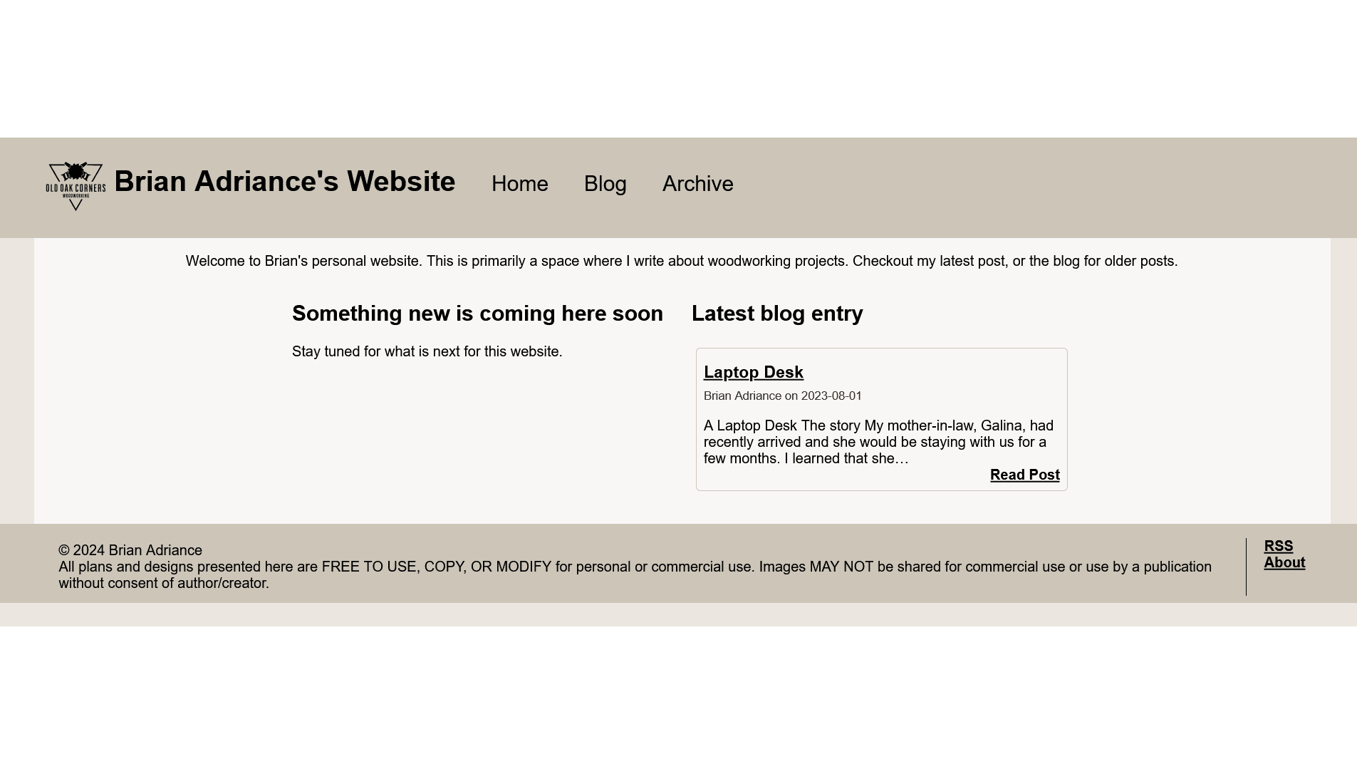
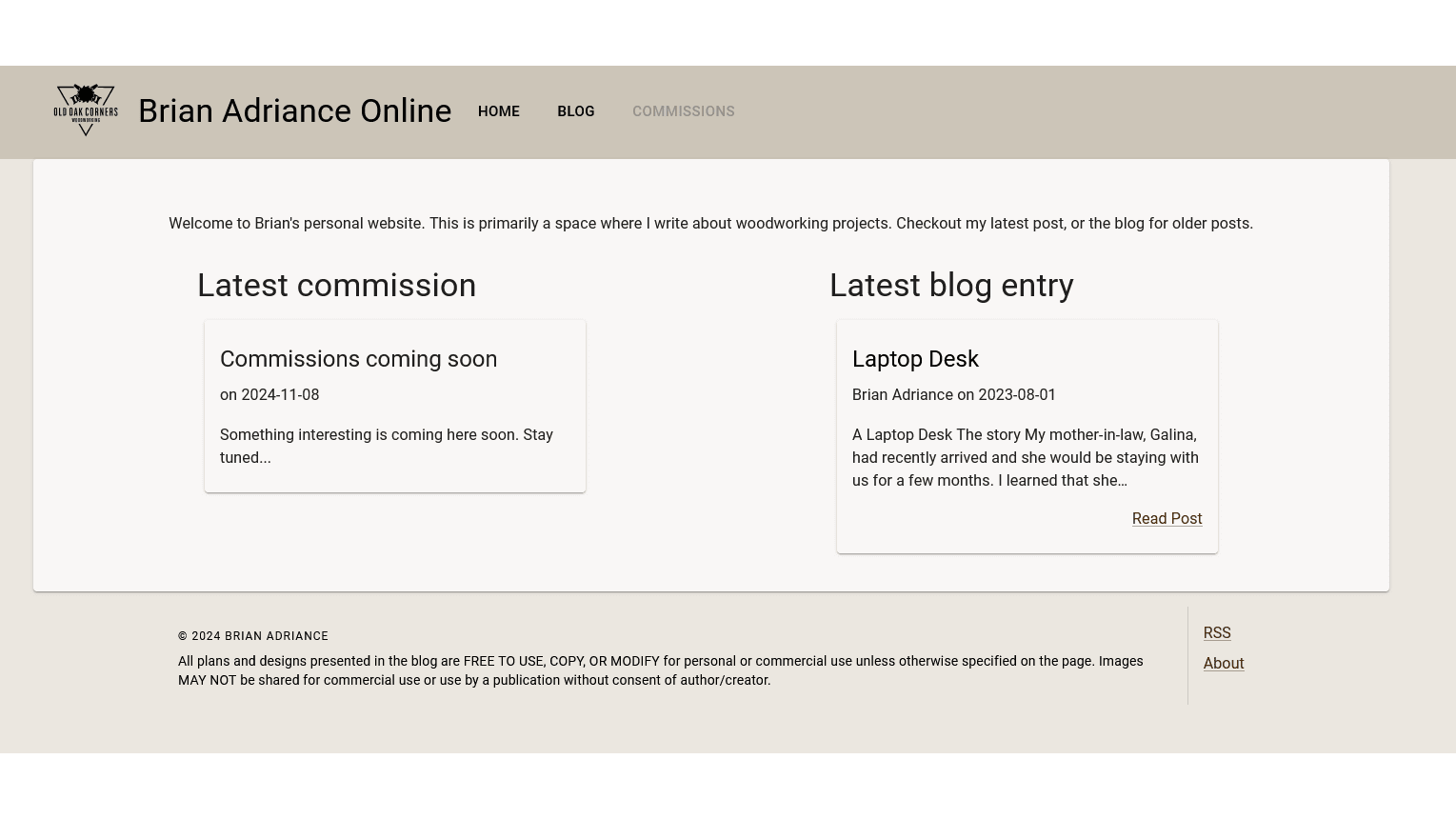
Now, since you're reading this post after the upgrade, it is impossible to know quite how much changed. Let's look at some before and after shots using a neat image comparison slider tool. Let's start with the home page. Unfortunately my screenshots are not exactly the same size.
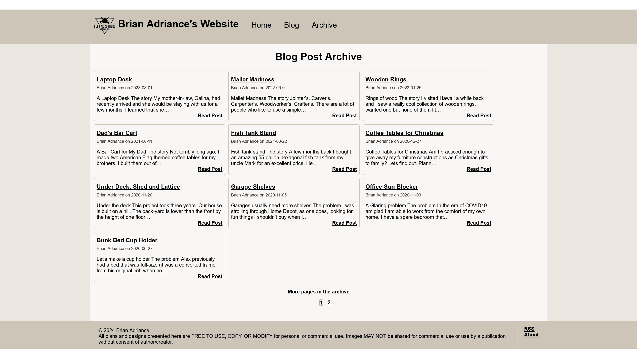
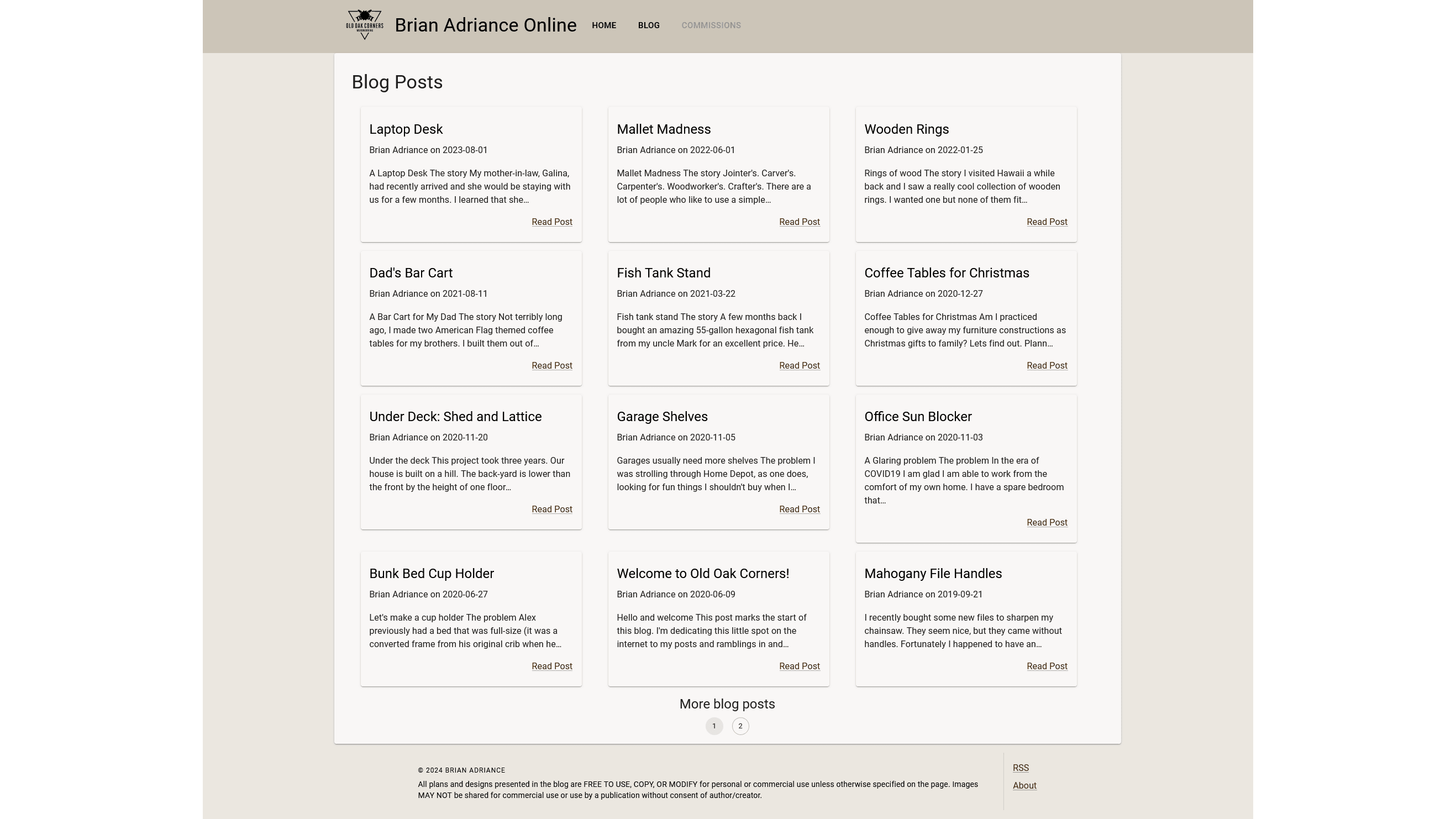
I cleaned up the footer a lot! In general it feels a lot cleaner. Next up, the blog listing page.
There's a lot more whitespace around the components, the font weights changed, and border became more subtle. Not shown, but I also removed the hover effect from the preview tiles as well. Let's look at the heading and footing for the blog posts themselves.
The screen shot got a little pixelated, but it still shows the difference.
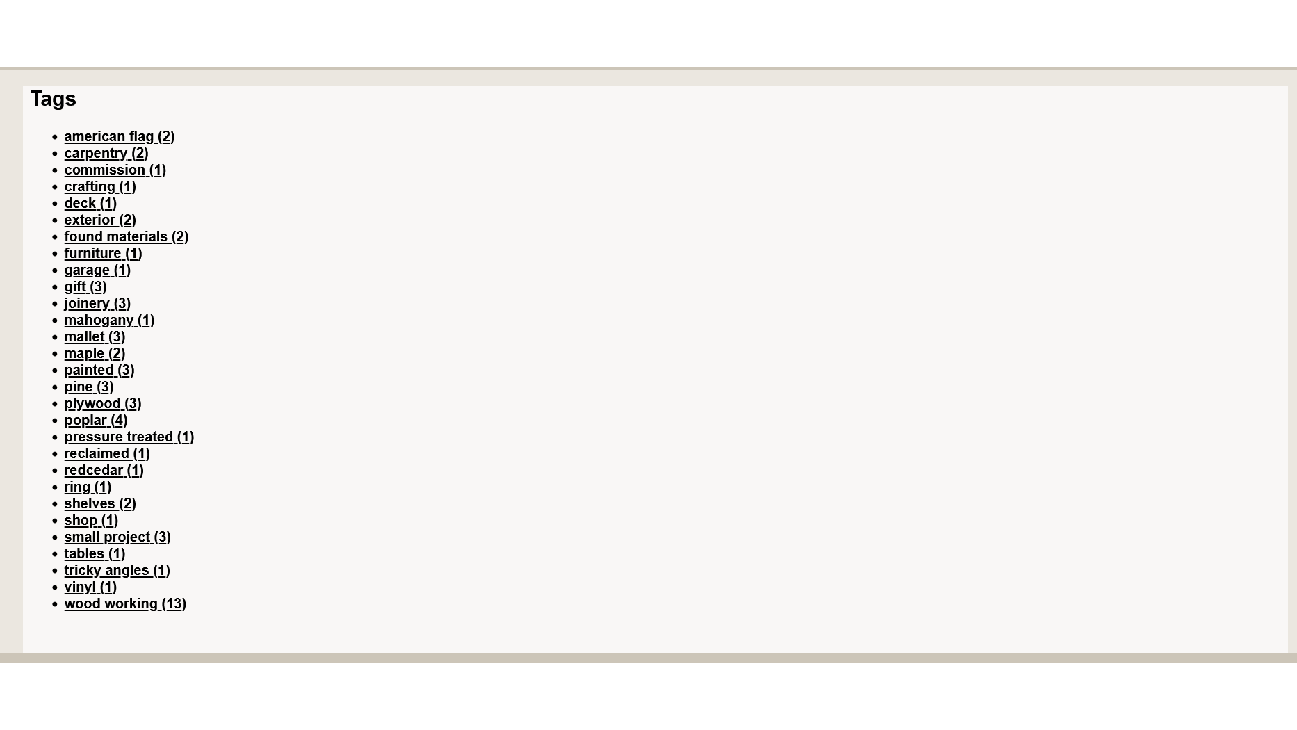
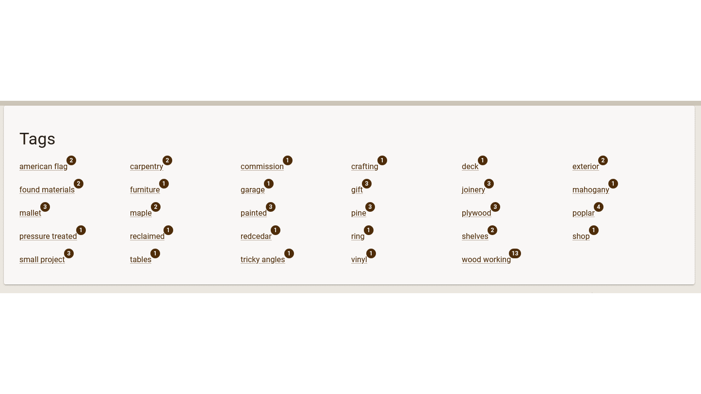
And finally, a page that probably doesn't get a lot of traffic: the tags listing page.
Conclusion
It was a decent effort, and I have been wanting to do some kind of improvement like this for a while now. Overall I am quite happy with how it all came out. There are also a few bonuses with the refresh: a sneak peek that commissions are coming soon! And expect a rebranding from Old Oak Corners to Laughing Woodchuck woodworking. I'll post on that later.
Are you feeling inspired? Want to do something like this yourself? Here's a list of what I use for my site.
- Hosting
- Netlify for the website
- Cloudinary for the images
- Github for code
- Disqus for comments
- Website
- Gatsby for the main site framework
- MDX for the blog posts
- Material UI for layout and components
- Programming language/framework
- Typescript for the primary language
- React for all the front end goodies
- Sass for the styles that MUI doesn't handle
- npm for the package manager
Drop me a comment if you do end up building a site for yourself! Happy coding!
